HR Diagram Explained
Oct 29, 2022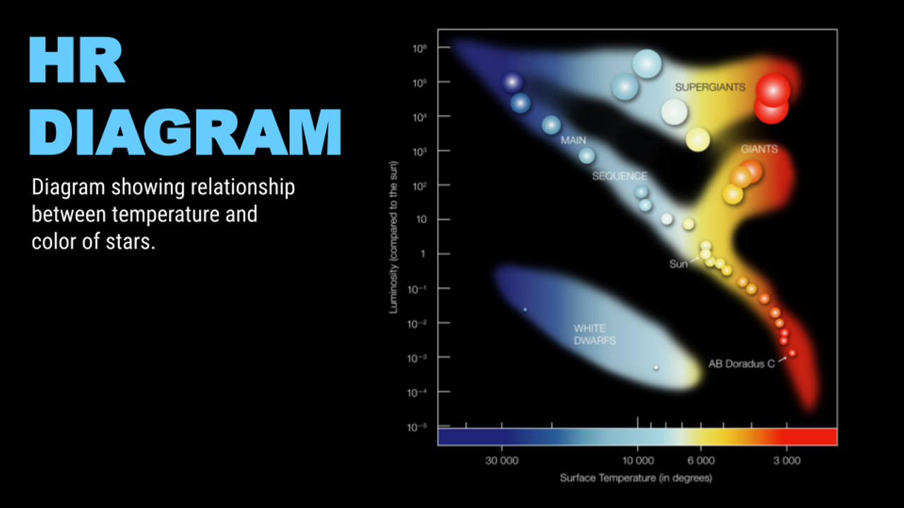
The Hertzsprung-Russell diagram, also called the HR Diagram, is a really important tool that astronomers use to show the relationship between star temperature and color against its brightness. The development of this diagram was a major step toward understanding how a star evolves and changes over time. This diagram was named after Danish astronomer, Enhar Hertzsprung, and American astronomer Henry Russell after they developed this diagram in 1911.
Understanding the HR Diagram

The HR diagram is really easy to understand if you are able to interpret what each axis means. The horizontal axis measures the surface temperature of the star in Kelvin. The stars that are over on the right are 3000 Kelvin and are much cooler and redder in color than the stars on the left. This diagram goes up to 25,000 Kelvin, but the surface temperature of a star can get higher than that. The vertical axis on the left measures luminosity. This luminosity scale is measured using the Sun, our home star, as our comparison. So a luminosity of 1 is equal to one Sun. Absolute magnitude, as measured by the vertical axis on the right, is another descriptive way to measure brightness. Absolute magnitude is the brightness of a star with its distance taken into account. The bottom axis identifies the spectral type or spectral class and is another way to describe the color and temperature of a star. The different letters represent different colors and temperature ranges. A common mnemonic device that can be used to remember the spectral class is: Oh Be A Fine Girl/Guy Kiss Me.
Life Cycle of a Star
Stellar Evolution can be identified by using the HR diagram, but in order to understand this you need to understand the life cycle of a star. All stars begin in molecular clouds with hydrogen and dust. Eventually, something hits this molecular cloud, perhaps a shock wave from a supernova, and then protostars begin to form. Most stars form within clusters that are hidden inside a nebula. Once a certain temperature hits these, or the stars reach a particular temperature the process of fusion begins. This is when a star becomes a main sequence star. When the process of fusion is happening, stars are fusing hydrogen into helium. You can have really massive stars that are blue in color, or you can have a low-mass star, like our Sun, or even a red dwarf star which is much smaller and dimmer than our own sun. Brown dwarf stars are essentially failed stars that never got hot enough to start the process of fusion. Our planet Jupiter is an example of a brown dwarf. Over time though as a star starts to fuse up all its hydrogen, and it starts to fuse heavier elements as the star enters its old age cycle. If it's a massive star it'll turn into a supergiant star. If it's a low-mass star, like our sun, it'll turn into a red giant. As it grows in size there won't be enough mass to continue fusion, so it will start to fizzle away into a planetary nebula, and when all the gases disappear, a white dwarf remains. A white dwarf is essentially a hot leftover core of a star. But even though it is really hot, it is not bright because it's very small (planet-sized). Eventually, the white dwarf will fade into a black dwarf once it cools down. In a massive supergiants star, such as Betelgeuse and Rigel in the constellation of Orion, the star will become unstable once iron forms inside of it, and explode into a supernova. Its final fate will depend upon its mass; it'll either turn into a black hole or a neutron star.
Stellar Evolution
Categories in the HR diagram can signify Stellar evolution. The long band that goes from the upper left to the lower right is called the main sequence band. That is where stars spend the majority of their life. They are stable in terms of the pressure from fusion, and gravity pulling everything to the center. So they are balanced stars. Over time a star's position on this diagram will change. They begin as main sequence stars, they evolve into giants or supergiants, and then eventually they fizzle away into white dwarfs. As a star gets older depending upon its mass, it will evolve differently throughout its life.

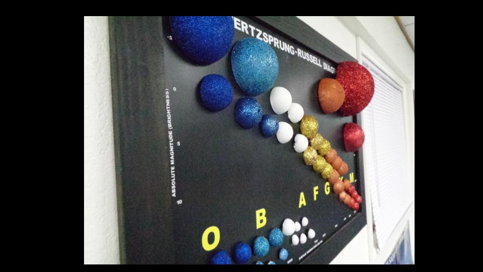
Make Your Own HR Diagram
It is really easy to make your own physical 3D model of the HR diagram. You can make many variations of this model but it is a fun and creative way to become more familiar with the HR diagram. All you need is some styrofoam balls, something to color them, and a board to hang them up on. One way you can do this is by using a magnetic board and super-gluing magnets to the back of the styrofoam balls. You can then label the board axis with spectral class, temperature, and color. You can test yourselves or others by removing the ‘stars’ from the board and then putting them back where they should go on the board. It is a great way to visualize the diagram.